Download for free the Caterpillar logo in vector (SVG) or PNG file format.
Caterpillar is an American construction machinery manufacturing company, founded in 1925 in california, United States. Today, Caterpillar is one of the world’s leading manufacturing companies. Manufacturing is on the Fortune 100 list, a corporation that provides finance and insurance to customers.
Nearly 100 years of existence and development, the logo has gone through 8 changes to achieve a complete image for the brand. After those 8 changes, the full name of the Caterpillar logo was used, however it was edited to be more perfect and consistent with historical circumstances.
Caterpillar’s first logo with curved black letters showed the caterpillar as its name. This logo existed for a fairly short time (6 years), and then the logo was changed.

The logo still keeps the word “ Caterpillar,” but it is written in a vertical style with red letters. The logo at that time was designed in a more wavy and strict style. With one year to exist, the logo of the Caterpillar brand is changed.
The logo switched to a black font in 1932. From then until 1957, the company had a narrower and more compact sans-serif font that looked modern and powerful.
If customers do not pay attention, they will not see the change in the logo during this period, because it is basically the same. However, the letters have been slightly edited, and the round initials have been replaced with square initials. The logo of Caterpillar at that time existed in two years and it was changed by the designers.
Once again the overall look of the Caterpillar logo PNG remains, unchanged; the company still leaves the word Caterpillar in black; however, the lettering has now been narrowed, and the space between the letters has widened.
The logo at that time was written in an extremely bold sans-serif font, with a strong style that affirmed the brand, with a black color palette representing the company’s traditional values. This logo passed 10 years, and later it was changed.
The logo change in 1967 brought newness to the brand. At that time, the logo had a moss green square with a white circle on it. And this logo existed for 22 years, proving that it was quite important to the brand and then people changed the logo in 1989 until now.
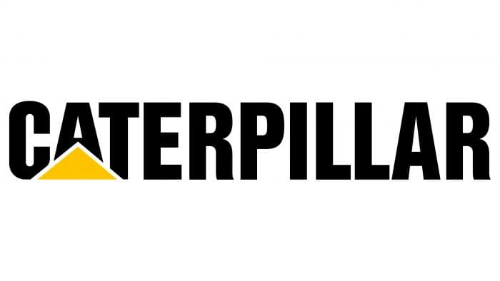
The logo of Caterpillar, for right now, was created in 1989. This is the word Caterpillar capitalized in the font CG Triumvirate Inserat and Nimbus Sans L Cond black. Below Cat, there is a yellow triangle to make the logo brighter and softer. This is also a detail that makes it easy for users to recognize this brand
The logo of the Caterpillar brand is yellow and black. The designers use black in the logo to show luxury and power and use yellow to show freshness and optimism.
The Caterpillar logo uses Helvetica font, and there are font edits to be suitable for aesthetics.
The Caterpillar logo fully represents the name of the business as well as the business’s message to consumers. Designed in black and gold, it represents both mysterious elegance and freshness and power of the company with the typefaces that are serif-free to show customers peace of mind about the business’s services.

 Microsoft Publisher Logo

 TW Telecom Logo