Download for free the Shell Oil Company logo in vector (SVG) or PNG file format.
Sell logo is the image representing the brand of Royal Dutch Shell company, headquartered in the UK and the Netherlands. Founded in 1907, the company operates in the fields of gas and oil exploitation and processing and chemical production.
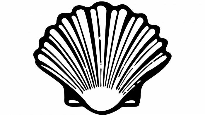
The logo of Sell first appeared in 1900, and until nowadays, the logo has changed many times, specifically 10 times. From a crude seashell in black and white, its current logo has been reshaped and colored yellow and orange.

The first logo of the shell was a rough black-and-white seashell, as its name. With the combination of black and white, designers create a logo that is pleasant and easy to understand for customers with their brand.

The vector shell logo of this period was also an imperfect shell, used in black and white, but with the outer oval removed.

The 21-year existence of this logo is a shape that resembles a seashell but also resembles a fan

The image of the logo was changed slightly; the seashell now had a clearer shape, white was used more to highlight the stripes on the shell, and the logo lasted for 18 years

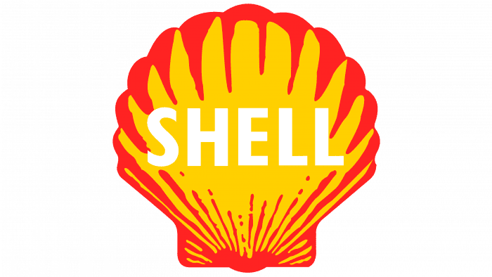
As you can see in the logo image, in this period, there was a big change in brand image design. Logo has 2 parts: emblem and logotype (seashell shape and shell word). The seashell is reddish yellow, and the word shell written inside the seashell is white.

The shell is now simpler in design, and the word shell inside is red instead of white like before, it existed in 16 years and then the designs decided to change the logo.

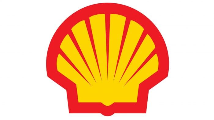
The current logo of the shell was designed in 1971; the word shell was completely removed, and now the logo only has the emblem. Besides, people also use sunny yellow instead of lemon to make the logo stand out more.
Today, the Shell Logo only has emblems and no words, but in the past, the word shell was used in the logo and was written in bold sans serif. Lowercase letters in “Shell” create friendliness between the brand and customers as well as the ease of understanding the logo.
Shell logo uses red and yellow; these two colors symbolize strength and optimism. these are also the two colors of the flags of many countries in the world. Strength and optimism will create a life that is always lucky and happy in your country.
The shell logo is an image representing a mineral and chemical exploitation and production brand belonging to Shell Trading and Transport Company Limited, headquartered in the UK and the Netherlands. As its name suggests, the logo uses the main image of a seashell. Shell words is appeared in this logo, but now, the logo has a complete emblem with yellow and red colors. Two freshness colors symbolize strength and optimism. The logo is created with a simple style, which helps customers easily recognize the corporation’s brand and feel secure in using the product.

 Inter Pipeline Fund Logo
 Reliance Private Limited Logo